
All examples · Example 34 of 34
Multi-Panel Figure (a–d)
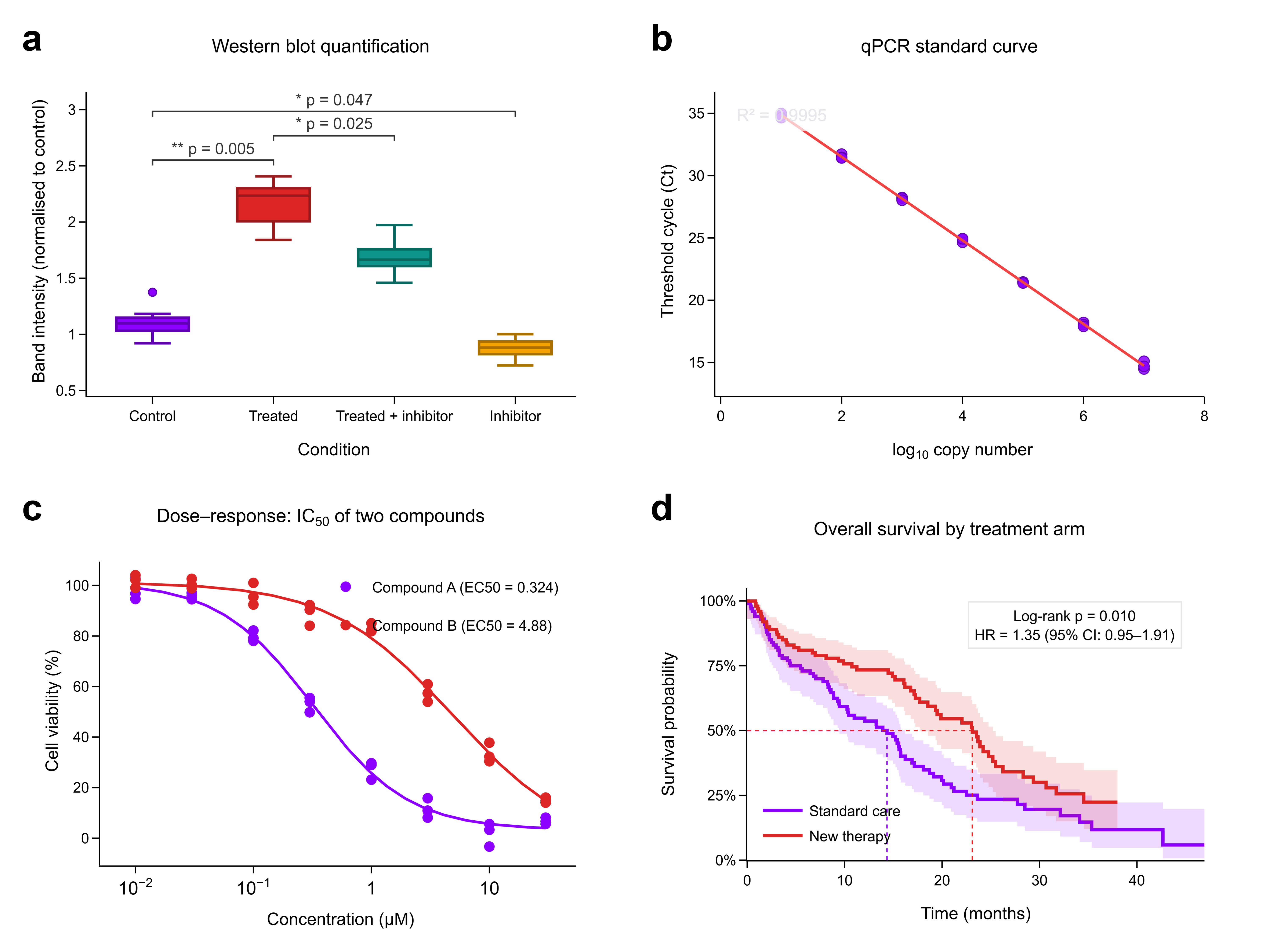
A four-panel figure assembled in LabTools: (a) western blot quantification, (b) qPCR standard curve, (c) dose–response, (d) Kaplan–Meier survival.

Statistics by panel
This figure assembles four other examples into one 2 × 2 layout with plot.compose. Each panel has its own full statistical report.
 Box Plot: Western Blot Quantificationb
 Scatter Plot: qPCR Standard Curvec
 Dose–Response Curve: IC50d
 Kaplan–Meier Survival Curve
Methods paragraph
Written to go straight into a manuscript.
Panels were assembled with LabTools plot.compose on a 2 × 2 grid with automatic a–d labels and exported at 600 dpi (PNG) and as editable SVG.
Every number on this page was computed by the LabTools statistics engine (version 0.14.3) from the example's CSV on 2026-09-23. Where a value was derived before the data reached LabTools (replicate means, paired differences, log odds ratios), the text says so. The data are simulated from a fixed random seed.
Get started
Run the same analysis on your data
Every test on this page is built into LabTools — from the statistics panel, the command line, or an AI assistant through MCP.